When it comes to designing the logo for your business, there’s a lot to consider. From graphics to colours to the all important logo font choice, these decisions can seriously impact the overall brand identity and peoples’ perception of your business.
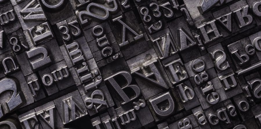
Typography can say a lot – aside from the actual words written in it – and choosing the right one should be one of the first steps to creating your perfect logo. Here are just some of the things to consider when selecting your logo font, and some handy tips for making sure you make the right choice.
Number of Fonts
Some logos are simple and stick to just one or two fonts, and we would recommend the same. Using multiple fonts can make a design look too busy and difficult to read; if you stick with a bold design, then you should make use of one or possibly two types of fonts to make the overall design clearer.
Logos with multiple fonts are few and far between, and those who do employ them, do so sparingly, ensuring that the different fonts are clearly separate in the design, either by drastic colour differences or spaced apart. Keep your logo font choice simple; it’s hard enough picking that perfect font, without having to do it multiple times.

Serif vs San Serif
The most common types of fonts are Serif and San Serif. Serif refers to the end strokes on some fonts, the little embellishments on the likes of popular font Times New Roman. San Serif essentially means ‘without Serif’, such as Arial. Serif fonts are often considered more traditional looking and can be found on the logos of brands like Canon and Vogue. Whereas San Serif is considered more modern looking and can be seen on many famous brands such as Spotify, Subway and Airbnb.
In 2016, you may remember Google’s dramatic logo change from Serif over to Sans Serif. Could this new, clean-cut look have been a way for Google to reflect on changing, modern times? Whatever the case, San Serif and Serif fonts give off very different perceptions about a brand. You should consider whether you value traditional or modern aesthetics when it comes to your font choice.
You can also use Handwritten or Script fonts for special kinds of effects. However, use them sparingly and avoid using them for large blocks of text, as they can be difficult to read.
Logo Font Size
Choosing the size in relation to other elements of the logo is an important design choice. You will want your business name to be the main focus of the logo and thus the biggest element, but you also won’t want it to completely overshadow any artistic elements, images or background colours. Play around with the size and ensure that it’s not too small to read, but also not so big that it outbalances the rest of the design.
Letter/Word Spacing
Tracking, kerning and leading are elements of typography that need to be carefully considered to ensure your logo can be read sufficiently. Tracking is the spacing between each letter of one word; if this is too small the letters could blur together – too spaced out, and it could become hard to read and may get mistaken for multiple words.
Kerning is the space between two letters. If too close together, letters are unclear – too far apart and they are awkward to read. Leading is the vertical spacing. Getting the balance right between the three of these is crucial for the legibility of the text.
Reflect Brand Identity
Fundamentally, a logo is there to BE the heart and soul of your business; it is your brand. It needs to be memorable and recognisable and importantly, reflect the values of your brand. Fonts can signal all sorts of ideas about your brand. Is it neat and tidy? Or playful, airy and fun? Does your logo signal traditional or modern ideas?

Take a look at your chosen font and decide whether it signals the right kind of impression that you’re after for your business. If you want to see your newly designed logo on some high-quality domed badges, contact Dash Dynamics today. We supply badges which are customised with your own design, logo and details all tailor-made to your requirements.
